Maia
Case study
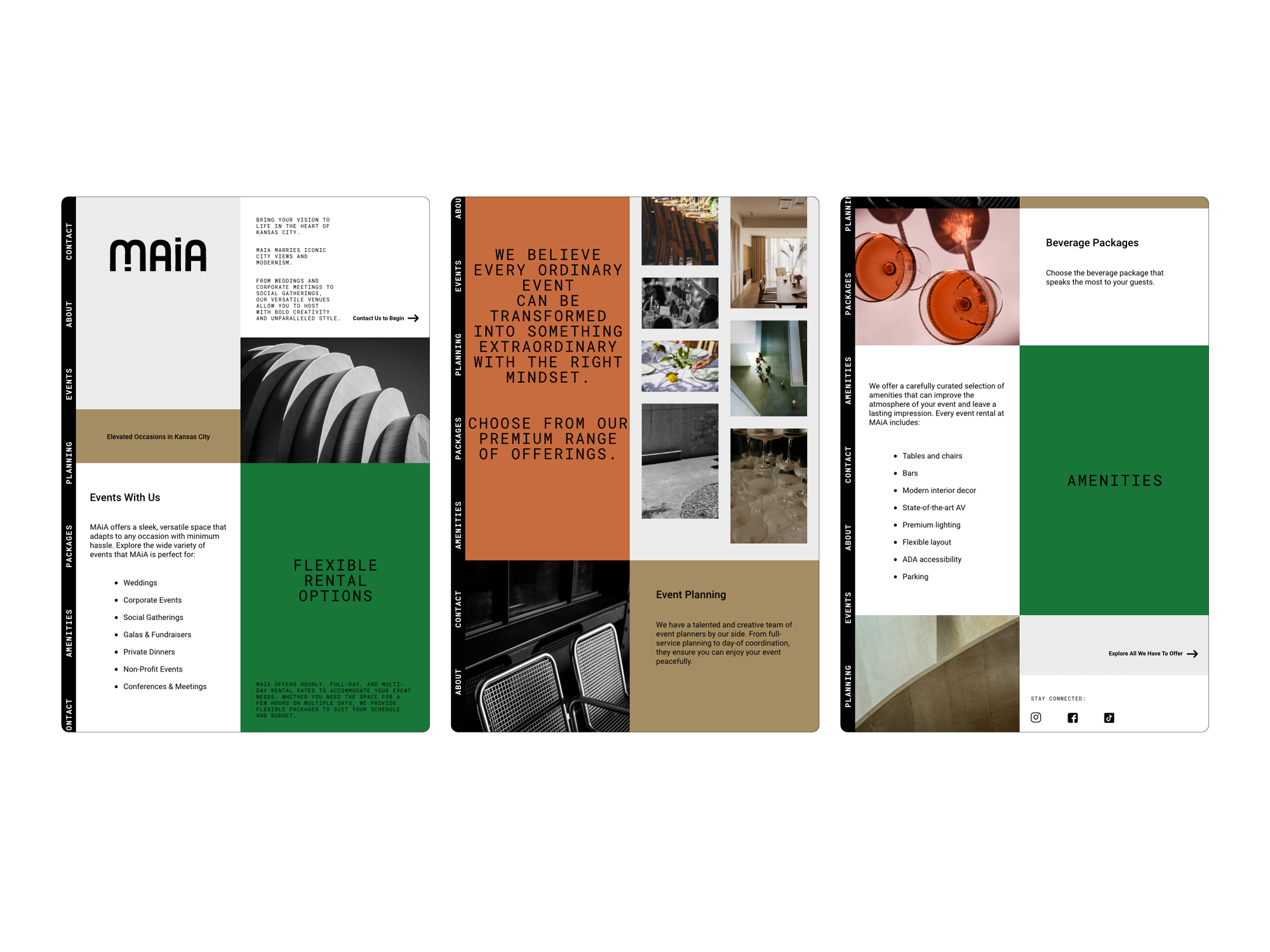
Overview
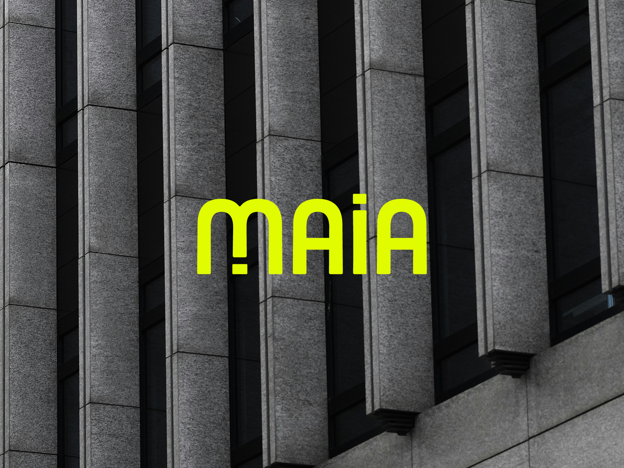
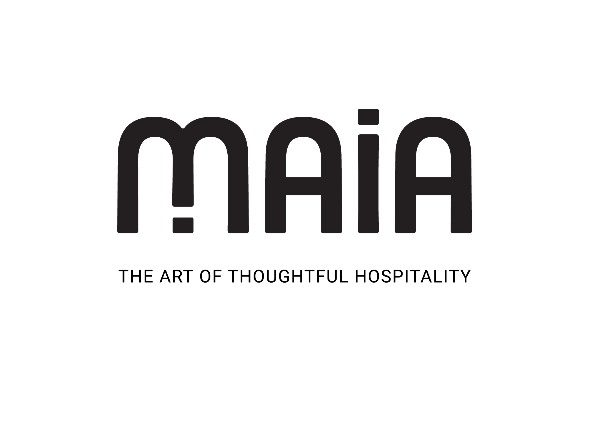
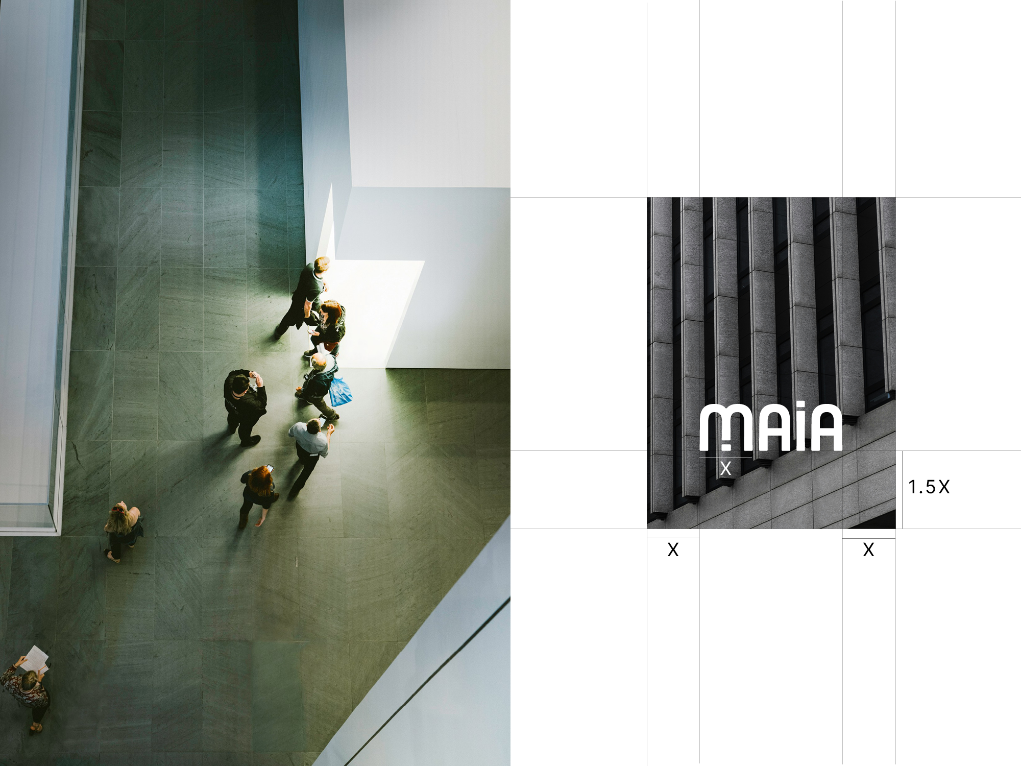
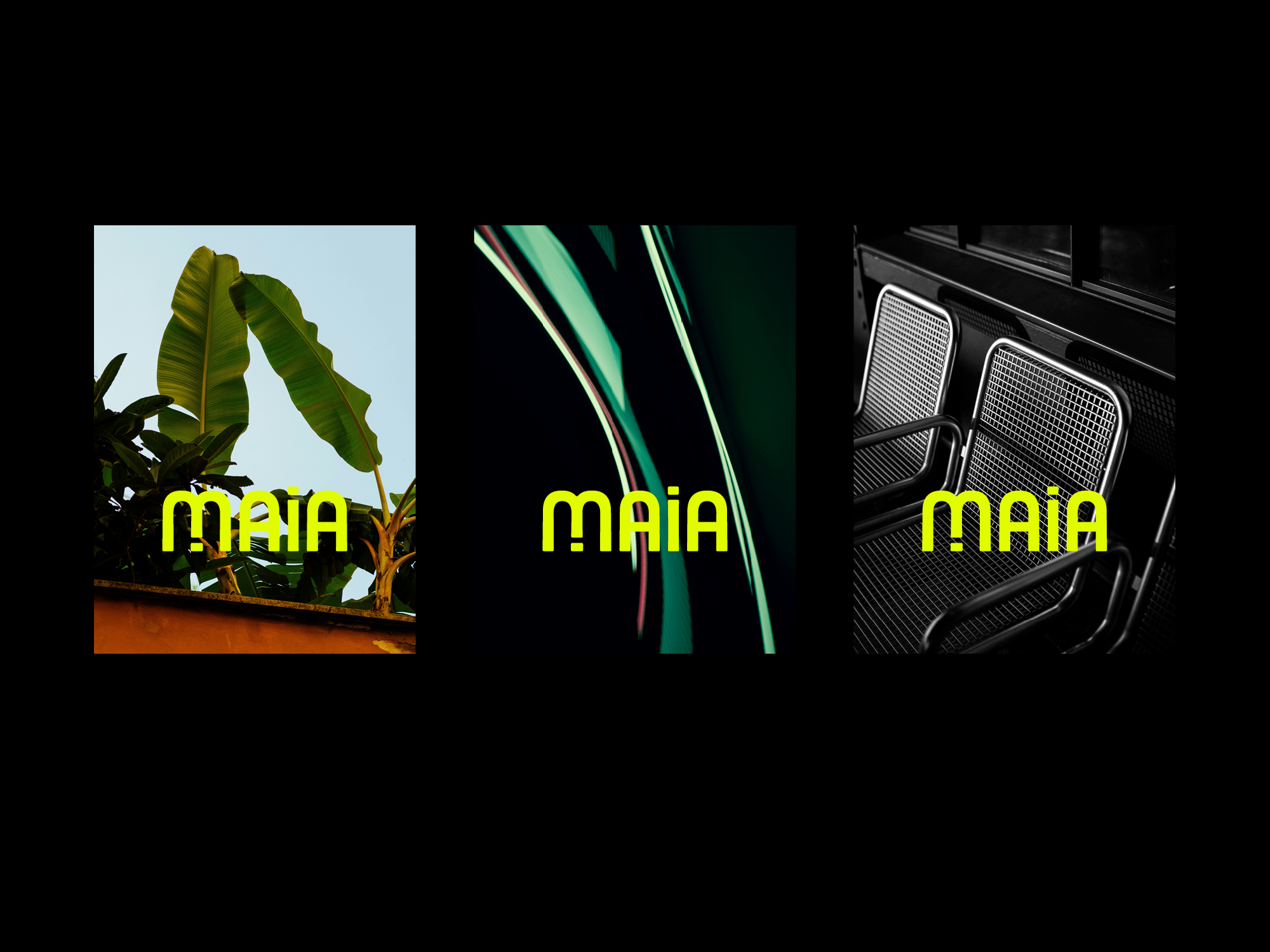
Maia is an elevated, modern portfolio of events spaces in Kansas City. With two unique spaces in the Kansas City Crossroads district, Maia an outlier in the events industry for the city. We needed a logo that could be instantly recognizable, that communicated sleek modernity, while remaining celebratory and accessible. The logotype and icon are largely inspired by mid-century design movements such as Bauhaus. A subtle fountain image is baked into the identity as a reference to Kansas City, "the city of fountains." The bold but welcoming identity system was applied across numerous platforms including social media campaigns, web design, and a suite of stationery.
Deliverables
Logo
Identity System
Digital Design
Stationery
No items found.